
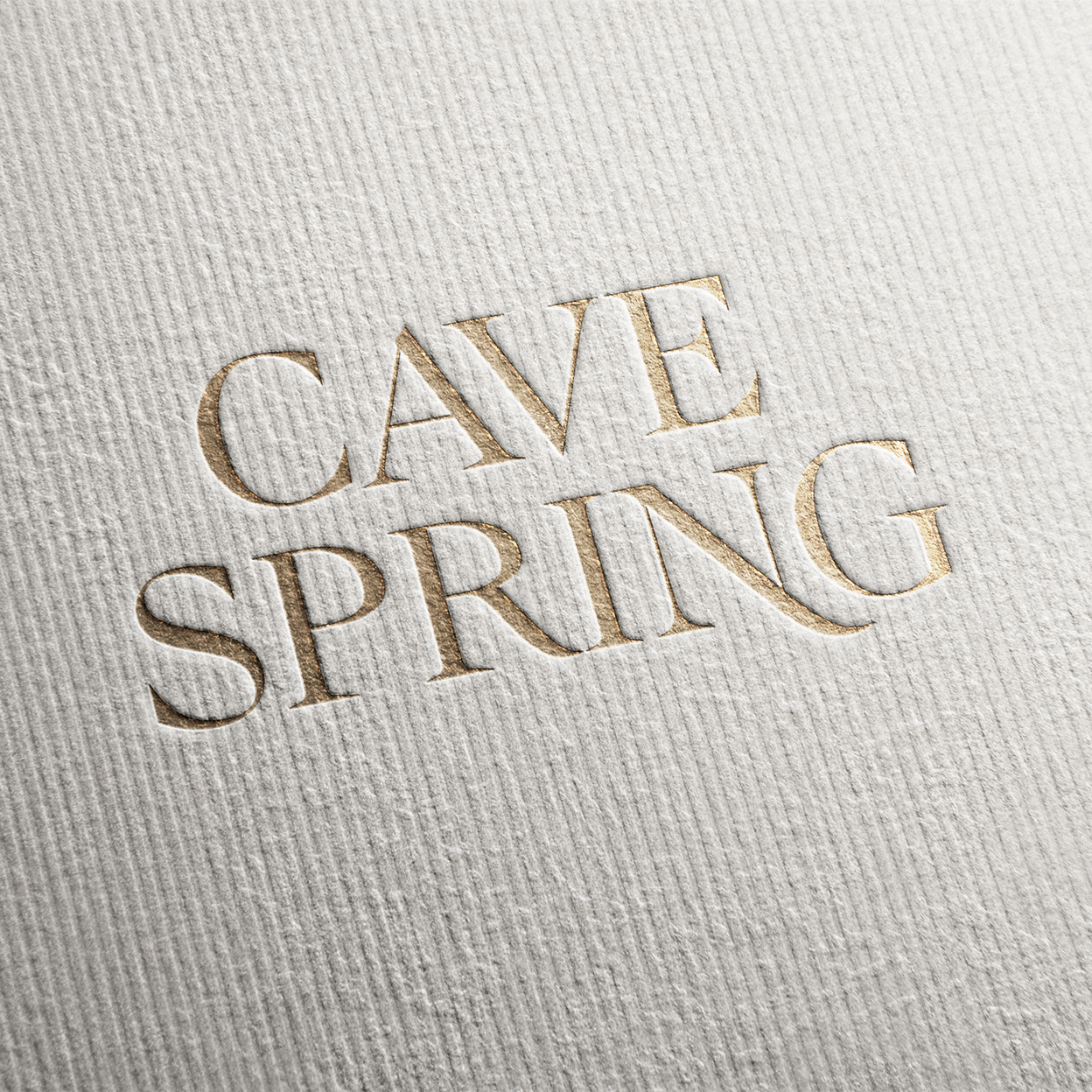
Cave Spring Rebrand
Cave Spring is a Niagara-based winery known for ripe fruit, minimal intervention, and a distinct sense of place. The brand was looking to evolve, elevating its premium perception while staying true to its Canadian roots.
The objective was to reimagine the identity and packaging system to connect with “appreciation” wine drinkers who value honesty over artifice, using a tone that felt bold, confident, and unpretentious.
Client: Cave Spring
Agency: The Turnlab
Role: Senior Art Director
Date: August 2025
Agency: The Turnlab
Role: Senior Art Director
Date: August 2025
Role & Approach
I led the creative exploration for the rebrand, developing and presenting multiple design territories to TTL and Cave Spring stakeholders. My role spanned from concept development through design direction, guiding the visual articulation and packaging system with a focus on clarity, balance, and distinctiveness.
Working closely with our design and strategy teams, I helped translate the brand’s ethos of restraint and craftsmanship into a flexible visual language that could live across labels, printed collateral, and digital touch points.
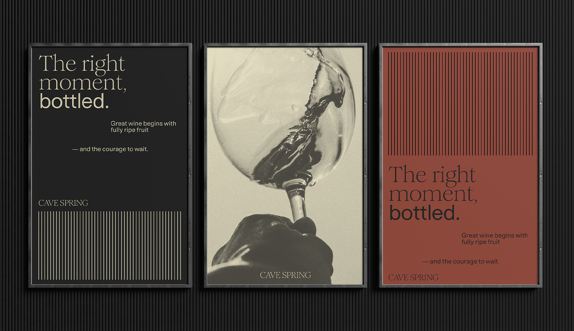
Creative Concept
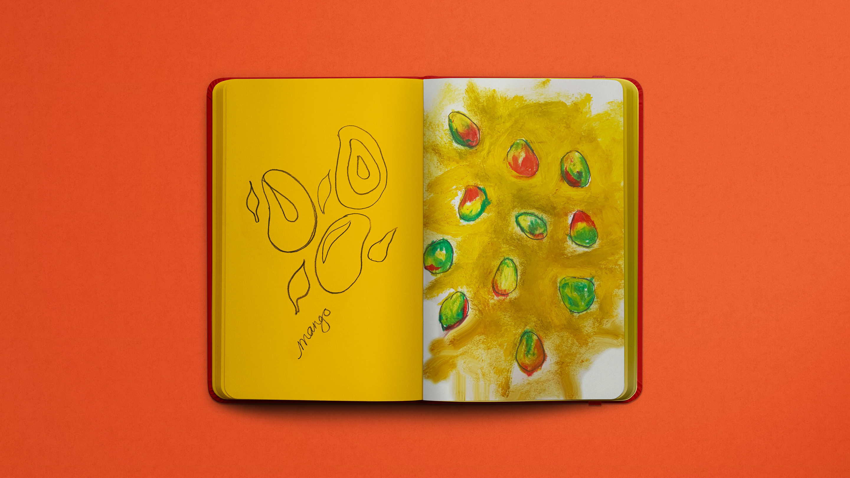
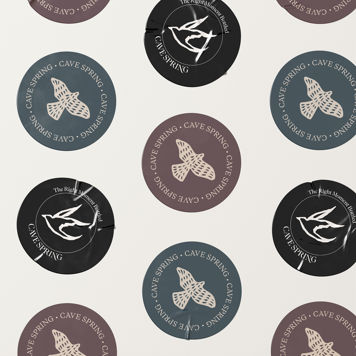
The concept centered on the idea of ripe confidence, the moment when restraint becomes its own form of boldness. Each direction explored how minimal intervention could signal mastery and care.
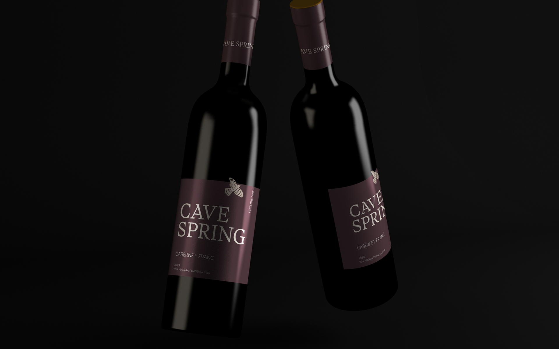
Design territories such as “Grounded Confidence” and “Elegant Rebellion” expressed this balance between clarity and individuality. The goshawk, a historic emblem of the brand, was treated as a symbol of precision and perspective, distilled into a refined, confident mark.
Execution Highlights
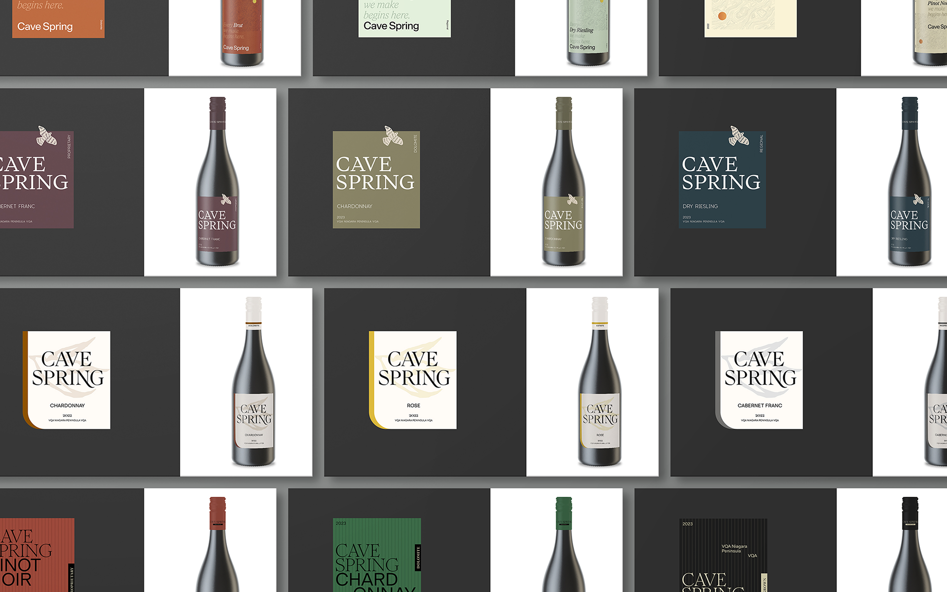
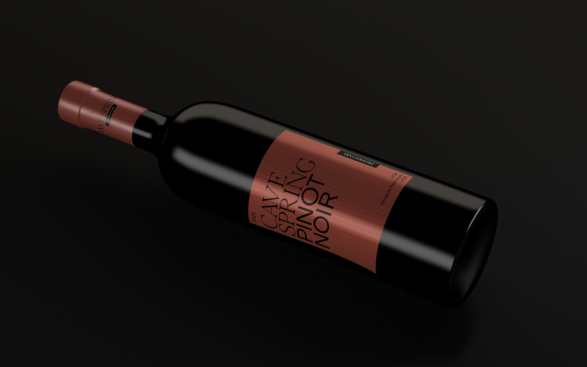
The proposed system extended through a modular label structure designed for clarity and shelf presence. A disciplined typographic approach elevated varietal recognition and regional cues, supported by a calm color palette and generous negative space.
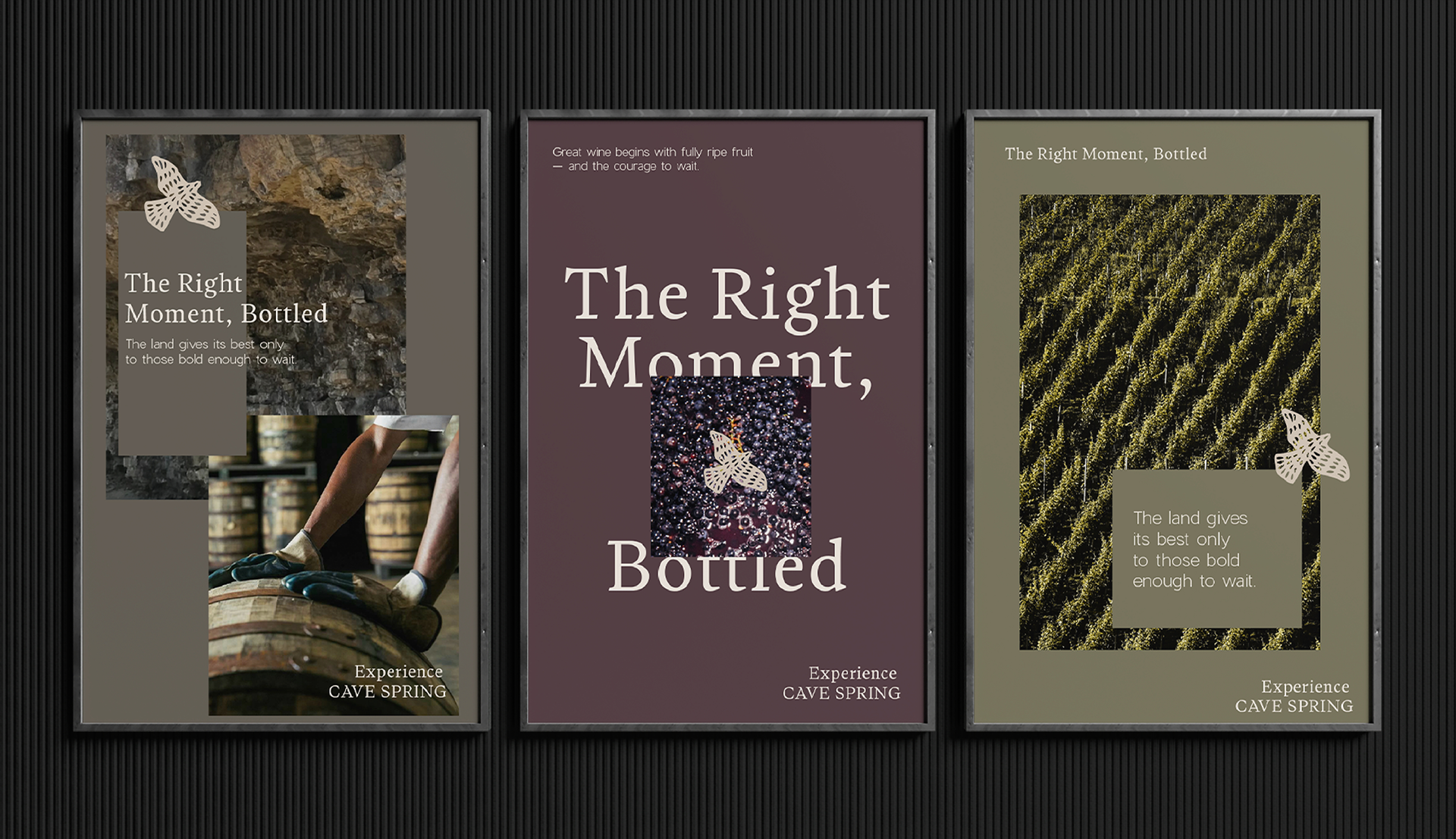
Supporting applications included digital layouts and printed materials that mirrored the packaging’s quiet confidence through tactile papers, refined grids, and a focus on composition. Every element was created to express purity and precision.
Outcome
Although the work remained in concept phase, the rebrand clarified Cave Spring’s positioning and offered a distinct, contemporary interpretation of Canadian winemaking. The exploration strengthened client confidence, set a visual foundation for future design decisions, and demonstrated how creative restraint can become a defining brand statement.